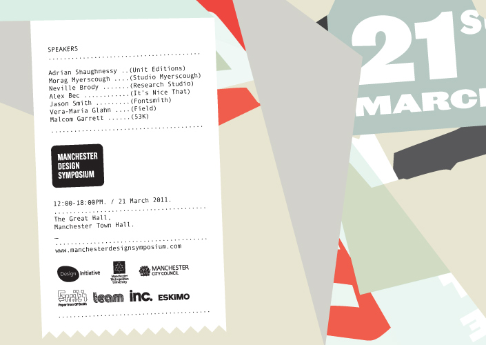
An inspiring day, with my highlights being the exuberant Morag Myerscough and the sage-like Adrian Shaughnessy.
Read MoreSomething I've read... Blink
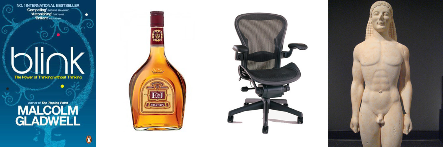
After a library reservation came in, I went to pick up Blink, by Malcolm Gladwell. Sub-titled 'The Power of Thinking without Thinking', I first came across this title a while ago while researching what our unconscious eye sees, from a designer's perspective. Even from my early art classes, I was taught about rules of composition, the rule of thirds, and later on the golden ratio et al and now it is without thinking that I arrange things in odd numbers rather than even where possible as it pleases the eye without, without the person knowing they like it better for that reason. These can be powerful tools and I wanted to find out as much as I could around this subject. While I understood just from the blurb alone that this wasn't the exact direction the book goes in the general power of our unconscious reactions interests me greatly.
Read MoreIt's all lies!
So I am a little behind with commenting on this campaign, the humongous billboard near Exchange Square in Manchester where I first really noticed it has long since changed, but I'll crash on regardless. The Kellogg's Rice Krispies Squares, It's all Lies campaign by ad agency Leo Burnett gets a big thumbs up from me. Firstly I like the visuals, the candy bright colours, 50s retro typography and screen print effect are pleasing to my eyes, they're not new, you're tripping over digitally created 'screen print' block colours on poster blogs and design sites, I've created a few myself, but that's doesn't mean it's not right for the job. To me it is fitting the bill for being simple, eye-catching in keeping with the feel of the product. And of course, as Alan Sugar always reminds his hapless contestants- you need a product shot, and this has a mega, in your face shot, but together with the bold colours and shapes it doesn't look at aggressive.
But I think even more than the cute, perky stripes and speech bubbles, it's the concept behind the campaign that made me want to express my appreciation. If you think of the product- it's not quite cereal bar, not chocolate bar, not something I think I'd ever suddenly sit up and decide I really fancied. So going away from the product is a good move in my eyes, no need to avoid the pesky health issue or what time of day the target market is supposed to be consuming said confectionery. When the product came to the UK market and was named 'Squares' there was obviously someone involved who had that slightly twisted sense of humour to call a cuboid, a square, so in a way, how have they taken so long to successfully revisit this concept?
It's cheeky and it must have liberating for the creators to be able to do all the things you'd love to do to promote a product (i.e. say it can change for life and is better than sliced bread, the moon landing and a Wonka bar) and get away with it with that little snapping tagline, It's all lies. A lot of us cynically think that most of what we see and hear across the media is a bunch of bobbins anyway, so why not go with the flow, and make it funny at that?


